
Christiana Basham
Work
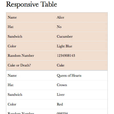
Alice Project
I added several responsive items to the site. This included a youtube video, Google calendar, web cam and a table. Creating the responsive table was particularly challenging.
A few things I did when creating the table:
- Used media queries to switch the table to the responsive view at 480px
- Created stripes using tr:nth-of-type(odd)
- Used position: absolute; to move the table headers out of view, while retaining the information for assistive devices
- Added the table header info back in as a label with td:nth-of-type(1):before { content: "label"; }
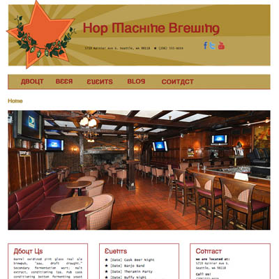
Hop Machine Brewing
I designed all aspects of the site. The wire frames, visual designs and logo were created in Illustrator. The HTML and CSS were hand coded.
A few things I learned while working on this project:
- I had never used a CSS reset before and after researching a bit, I decided to use a limited reset to remove margin and padding from the majority of elements.
- I wanted a headline font that would fit the Soviet propaganda poster-inspired visual design. After exploring several options including Google Fonts, I found Kremlin Minister, a ttf font. To import it, I used @font-face.
In the main navigation, I wanted to have a rollover effect where a star would appear before each link. When I designed this, I had no idea how I would make it happen.
To make content appear before the navigation item I used nav a:hover::before. For the star, I used content: with the unicode hex value for "Black Star" and then changed the color to the appropriate shade of red.
This worked, but caused the nav item to slide to the right when the star appeared. I solved this problem by using margin-left with a negative value.
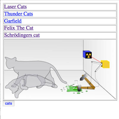
Javascript Project
This was a JavaScript programming project where the goal was to exchange one set of an image and links, with another set.
The Solution:
- Used a button as the means of initiating the change
- Stored each set of links and images in its own array
- Used Switch to change arrays when the button is clicked